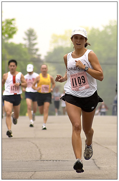
Taken at the Missisauga Bread & Honey 15km race.
My wife, finishing 20th for all women and 6th in her age group in a time of 71 mins 28 secs. I liked the fact that this shot showed the three guys trailing behind her and the slight mist in the air. Maybe not the perfect cover for Runner's World, the lighting could have been better and if only I could have dodged her face as it is a little too hidden by the shadow of her hat, but I like it and it's the best thing I have this week. Beside, it lets me brag about how proud I am of my wife's running skills!
Statistics
Place: 20 out of 232 Avg (all users): 6.5309 Avg (commenters): 7.8571 Avg (participants): 6.4961 Avg (non-participants): 6.5690 Views since voting: 1853 Votes: 243 Comments: 24 Favorites: 0
Great capture - I especially like that both her feet are off the ground and also the positioning of the three closest runners off to the left of the frame. Could do with a little fill-in light on her face which is a little shaded by her cap. 8
I like tha way the runner caught of the ground and the position would be good for a magazine its a pity the cap makes the face a little too dark though
Nice sharp focus... I'd like to see her more in the center of the frame, as currently too much attention drawn to the runners in background by this composition. They dont seem relevant enough to warrant inclusion...
Nice shot, Gordon (I think)...like the balance of foreground and background subjects. As a runner myself I was hoping to do a similar shot but had no time these past weeks...
excellent shot. great focus and clarity of the front runner. Love how you caught her in the air like that. angle and framing/cropping are good, but the powerline running right through the shot is a little distracting. it slices the woman right in half. otherwise great shot.
well done on the selection of this for the challenge - there aren't many shots here that are suitably composed for a mag cover but this certainly fits the bill, with space at top, bottom and left side for text - an 8 for me for that alone
Too bad she was wearing a cap. Her face is a little dark with shadow.
This is my only gripe. otherwise I would have giving you a 10.
It wasn't your fault just the circumstance. 9
Great image! The expression on her face is good and the stop action is clean but obviously you can see the motion without needing any blur. The composition is great with an appropriate dof. I'm sure I would be encourged to read the accompanying article. It seems the sky wasnt working for you, but as a magazine cover it makes a great place to put the title so wouldnt be detrimental to the image at all.






 Add photograph to your favorites
 Add photographer to your favorites


 Photographer found comment helpful.


