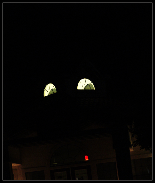
Great shot ....IMO maybe a tighter shot of the "eyes" cropping or leaving our the Exit sign and doorways would take away the distractions. Great entry --7--
I feel this shot has way too much negative space without really adding anything to the suject. A tighter composition could have lent some substance to an otherwise somewhat static shot. I also think the red light towards the bottom is distracting. Good effort though.
Very cool. Might I suggest cropping everything but the windows out. With all that room up top it gives you space to work with. The lights/objects at the bottom take away from your messge.







 Add photograph to your favorites
 Add photographer to your favorites


 Photographer found comment helpful.


