|
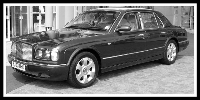
A nice black and white - the building in the background is distracting, especially at the left side, but I don\'t see how you could have blurred it out without also losing the crispness on the car itself, which would have been a poor trade-off. This might be hard to fit on a cover, unless they frame it above and below with dead space or use it as a smaller accent picture. |







 Add photograph to your favorites
 Add photographer to your favorites


 Photographer found comment helpful.