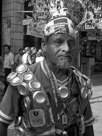
Great portrait! Lighting seems very odd - seems to be a shaft of sunlight falling only on his nose - perhaps taking a shot a few seconds earlier or later might have caught him with light on more of his face. I'd also, personally, prefer the background to be thrown out of focus more, though the demonstration (?) behind may be relevant to the story? Would be an 8 or 9 with better lighting and less distracting background.
From what I could understand of the site (no habla espanol), this is not a magazine, but a site to display pictures, etc. If I am wrong, please correct me and I might change my vote.
LOL. Nice photo. This would have been perfect if not for 2 things. The left part of his face is a little too dark, and that tree behind his head is a bit distracting. Need something solid that his multi-colored hat would stand out against. Cool subject though.
maybe composition would be better if this guy is totally cropped on his left side, near the neck because when I'm looking at the photo he is looking right and he moving my eyes on the right side and there is nothing to see. = 4
Fascinating subject - the background is somewhat distracting, though, especially the tree; a shallower focus might have drawn the eye more completely to the man in the foreground.






 Add photograph to your favorites
 Add photographer to your favorites


 Photographer found comment helpful.


