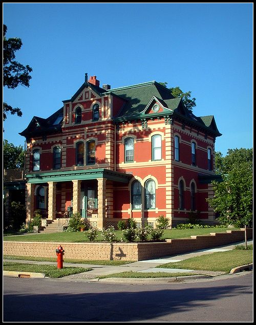
This photo features a old German style house that has has been completely restored by it's owners. It has taken them years to get it done, but I believe it was well worth the wait.
It is located in New Ulm, Minnesota which is rich in German heritage.
Photo stats:Date & Time: 2003:06:09 06:55:01
Image Size: 1536 x 2048 pixels
Camera Make: FUJIFILM
Camera Model: FinePix 3800
Aperture: F/8.2
Exposure: 1/150 sec
Focal Length: 6.9 mm
Metering Mode: Multi-segment
Exposure Program: Program normal
ISO: 100
Statistics
Place: 49 out of 232 Avg (all users): 5.9749 Avg (commenters): 6.3333 Avg (participants): 5.8595 Avg (non-participants): 6.0932 Views since voting: 1198 Votes: 239 Comments: 29 Favorites: 0
Great pic, but the I would have preferred a tighter crop of the image. The shadow of the tree in the street is distracting and does not add to the photo subject. i.e. the house Nice lighting
Beautiful house! Very sharp photo. Kinda mixed feelings about the tree shadow, but I'm not going to ask you to cut down the tree to see if it's better!!! I like it! I've never heard of your mag, but I'm willing to go with it. 9 Rob the Swash
the shadows of the trees are very harsh on the house and the street, otherwise, I think the angle is great! Maybe a tighter composition where you got closer to the house or were higher up to cut out the street might also work? Good work.
Excellent image, especially the pole and sign post that aren't there, and, the fire hydrant. All create an impression that this house is safe, and don't ask me why, because it does.
Shot is ok. Shadow from tree is kind of distracting on the house. Wait for better light next time. Also, I'd like to see less street/sidewalk in the photo. Keep the composition strictly to the house next time.
Small world. My sister just emailed me to tell me she walks past this house nearly everyday. Do you live in New Ulm? Martin Luther student? Anyway 8 on the picture. I think a tighter crop would help, but thats just me!
I was about to give this an average score but I took the time to look as back issues from the magazine and realized that this could very well be next months issue. Good job.
I wish this was taken a little bit too the left with more of the tree that you cut off. This is why I wish spot editing was allowed so you could remove the fire hydrant from the front. Nice colors and lighting though. 6.
Very pretty. I like the brightness of the sky in contrast with the color of the house. I think it would have worked better had you either centered the house or had it more to the right than the left. With the taller of the trees also being on the left, it makes that side of the page a little heavy compared to the right. Otherwise, a nice photo.
This shot would be better without the shadows on the house and street. Nice shot, well framed. I like how it is done from the corner rathe than from straight on. Good attempt!
Very nice shot, well composed - interesting subject. Possibly taking it at a different time of day so that the shadow didn't obscure part of the building would have made it even better, but overall very nice.
I think this could have been more effectual by cropping in... I think the bottom part, with the shadow is just extra space, although the top gives room for words, but I guess you could put words at the bottom as well. I think I might have cropped to the top of the brick thing in the front yard and maybe some off the right as well. Very nice house though, could definitely fit the magazine.






 Add photograph to your favorites
 Add photographer to your favorites


 Photographer found comment helpful.


