I want to thank all the people that have commented (positive or negative) my shot.
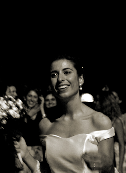
I know, my picture looks a little too dark but I have a problem with settings of my monitor :(
In my computer it seems more bright.. (and I have the same problem with Self-Portrait, damn!)
Anyway, I'm happy that many people "fell in love with my bride" - she's one of my best friend -, I'm sure she'll really appreciate your words. Tomorrow I'll make a surprise to her. She come back from honeymoon and I'll give to her as a present, a printed real cover version of my shot. Life, of course!
It's veeery nice.
P.S. sorry for my awful english..
Hey, there's no accounting for taste. I really thought you were a shoe-in for top three. I really felt like I was looking at Life magazine sans title. One of my top picks in any case. :)
The strong highlight in her right eye makes it look like a glass eye (no offense if said eye is actually glass :) It's a nice photo that definitely captures the action of the moment. I like how the ring stands out! Would have liked less blackspace up top and more of the bride. 7
Wow! I think this is excellent - very Jacky Kennedy/ Audrey Hepburn. I like the lighting, the slightly dark feel (dancing outdoors at night?), the way her hair merges into the sky and the candid nature of the expressions. Great also to have captured motion in her arms and in the applause of spectators. Wish she had that reflected light in both eyes though you could add that in before putting this on sale on DPC Prints if you were intending to do that? 10
motion blur on her hand and really all of her really throws this shot off, though I like the smile on her face and the general composition. Good use of bw too, gives it a timeless feel.
WoW, a classic photo, the color is amazing, the movement is pure magic, the stillness of her face amongst all that action...looks like a photo taken by one of the old masters...a really, really good job...I wish I could give it an 11 :)
My favourite this challenge! It's a lovely picture, and very appropriate for LIFE magazine (is it still around? I went looking for it and couldn't find it.) ~My only 10
I like this a lot. I can tell there's real emotion here, although I don't know what the event is. Good choice of BW. It would be nice to have a hint of the event in the title. It seems there's a little motion blur, which is distracting for me, but I'm still giving it a 7.
I am guessing that you left a lot of space at the top for a title. If i am right then I think it is a little too much space. The rest of the photo is very good. I like the smiling woman and the smiling faces in the background. I wonder why it is in B&W. It seems to me that a magazine named LIFE would be in color. Anyway, nice image.
I think that this is a wonderful image! I enjoy the lighting - shutter speed - aperture combination. You've conveyed joyful emotions and happiness, motion, and enough detail to be drawn in to the subject. You've also captured the faces of the onlookers in the background without sacrificing the focus on your main subject (the bride). I give this one a 10 (which is a first for me).
really nice, fits the style of this particular magazine very well, good use of the negative space, too, for the photo itself and left over for the title and "blurbs", too, 10!
This is a great idea for a Life cover; it seems to match their design ethic perfectly. It is unfortuante, therefore, that the image is not up to the same quality. 6 Jak
Black and white for a cover page. Hummmmm.
You left a lot of room on the top and left little room on the side for sub-titles.
The hand is a little blurred.
a bit dark, emphasised by too much top black, but otherwise an excellent image. I'm in two minds whether or not the faces behind are distracting or not. I think that they add character, certainly.







 Add photograph to your favorites
 Add photographer to your favorites

 Photographer found comment helpful.


