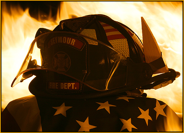
I took this in my living room. My lovely wife deserves the credit for the flag and backdrop. Originally the flag was the backdrop but it wasn’t working out. She suggested I place it under the helmet and use a black backdrop then repositioned the helmet a bit.. Thanks honey great idea.
Anyhow it was a 30 sec exposure and I used a small perfume bottle and lighter to puff little flames in back and front of my helmet. Then I puffed 2 more in front high above so you could read the shield and get a reflection of the flame in the safety glass. Yes there was a fire extinguisher nearby ;-)
Statistics
Place: 29 out of 232 Avg (all users): 6.3655 Avg (commenters): 7.7500 Avg (participants): 6.4677 Avg (non-participants): 6.2640 Views since voting: 1807 Votes: 249 Comments: 24 Favorites: 4 (view)
Technically I would like to see a little more light/emphasis on the name{s}, and the flag, but that is in the photographers mind. Images like these are all important, they make sure we never forget.
very dramatic :) might've been nice to have a little more lighting on the front of the shot, as it is pretty dark and hard to see the details of the helmet.
Hmmmm, interesting. I liike any photograph that incorporates fire. I think you should have tried to get some light on the front of the helmet/flag... too dark.
wonderful shot. wonderful focus and clarity. this shot is really good, but looks like the flag is on fire in the bottom right corner. Not really sure what is going on. why the flag in the middle of the fire? Still a really great shot. the fire looks good, and the detail in this really makes it for me.
Nice work! I'm sure you'll get the odd 'should have been portrait not landscape' comments for this (and I tend to agree with them in general, but there ya go :)). More flames above would have lent itself well to a portrait crop. I think you could sell this for editorial use. 9.
Some you guys that post here need to just leave us newbies alone. LOL!!! This is an AMAZING picture!!! Certainly the work of a pro. I know some people have complained about the orientation of the pictures but I would publish a special edition in Landscape just to be able to us this picture on the cover.
This is a very cool idea. I wish the lighting were a bit different so we could see the details in the helmet a little more. The flames are awesome. I would change the orientation for a mag cover (I'm sure you've heard this already), but I'll still give it a 7.
There is certainly a great mood from this, a varied range of emotions. The image itself is good, powerful, and dramatic. It's certainly something I'd expect to see on a magazine cover. The flames in the background are really effective, certainly adding to the drama. The helmet is a little dark, I'd probably like it a little lighter, but it's more sombre dark. The flame on the right is a little distracting, but it also causes me to wonder how the image was taken. A ring of fire around the helmet in the center? The flames seem to be high and scary so I hope the owner of the helmet was around to aid you with them after the shots were taken. Great image!





 Add photograph to your favorites
 Add photographer to your favorites


 Photographer found comment helpful.


