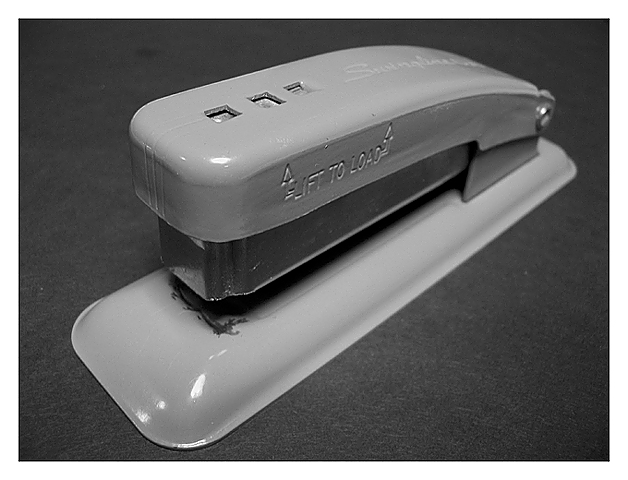
This is a nice, simple shot. Black and white seems like a good choice, although it might add interest to have the image in colour. The picture is nicely in focus. Light is OK, but not great - the glare on the front right corner of the stapler in particular is distracting. I think a bit more contrast would be nice. The simple white mat (border) is a good choice here.
It is hard to know what to say about this image. It is a fine shot, but it's not an exciting picture, and IMHO few people will spend much time looking at it or coming back to it. Anyway - keep shooting!
Nice composition adds depth to the subject. Black and white gives attention to its form, which seems appropriate here. I find your lighting less interesting than your other elements, but this is a straightforward "stock" photo of a stapler.
Might make an interesting catalog photo. I question the choice of black and white but I'm just like that... still, as your subject is itself not something most people are going to spend a long time looking at, having it be bright and colourful might help.
Very sharp photo. A little glare, but otherwise good lighting. Good angle for subject. Not as much art as office supply, very low "WOW" factor. 7 Rob the Swash





 Add photograph to your favorites
 Add photographer to your favorites


 Photographer found comment helpful.


