Overall
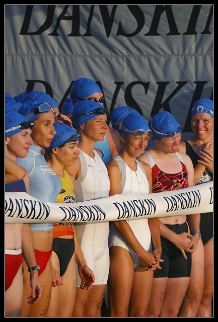
You did what you set out to do - create a piece which would fit the magazine cover of your choice. Of course, that's obvious, but given some of the comments (and entries which were placed highly) this challenge attracted, I think that your shot is a better result than your final position achieved. Leaving space for the title was good, but I suspect some may have marked you down for it.
I like the various expressions. Outsiders to any field often have stereotypical ideas about what kinds of people enjoy that field. But, to those inside, the types are as varied as anywhere else. Here, you captured exactly that - different human reactions and strategies at the beginning of a tense race.
Technical
I'd have liked a little deeper dof to include the runner in the far left. Otherwise, absolutely fine. I'm amazed that you could capture so much light on such a short shutter speed.
I'm with Brumos!
And I must disagree with a comment below - it's precisely the range of real expressions - from calm to excited to absolutely terrified/ in pain - that makes this such an excellent shot in my opinion.
Kavey
Excellent capture - nice light, great expressions, good composition, love that their outfits are all different yet they are tied together by their caps, the "danskin" line helps composition as does the backdrop.
It might have worked better if the athletes shared the same waiting/anticipation expression - ie: croped out the right 3 contestants. Or perhaps a longer shot so the expressions wern't so important.
Professional photo, just what I'd expect to find on the cover of the Triathlete Magazine. I buy it each month so you got my top vote for this one - 10.
This is a nice photo, i like it. I really like all the different expressions on the contestants. The blue caps also makes it somewhat comical at a time when everyone is so nervous. 8.
I find this hard to believe for a magazine cover - in part because a shot that didn't have number 12 on the right, grimacing as if in pain, might be a bit more attractive. Perhaps a crop that stopped at the woman next ot her might have worked better for this.
#38 looks the most focused. I like this shot for the different emotions on their faces and the different skin tones on their legs. Great idea, but a little short on "wow".
Excellent work! There are relatively few shots in this challenge that really look like they could be on the cover of a magazine, but this is certainly an exception. The expressions are great, and I find it interesting that they have their numbers printed on their legs! - 10
Great image! The range of expressions on the faces really tells a story. A mixture of nerves and excitement but the middle lady seems very calm and reflective. This serves as a great introduction to an accompanying article. I'd certainly expect to see this on the front of a magazine. Wonderful photojournalism.





 Add photograph to your favorites
 Add photographer to your favorites


 Photographer found comment helpful.


