GREETINGS FROM THE CRITIQUE CLUB!
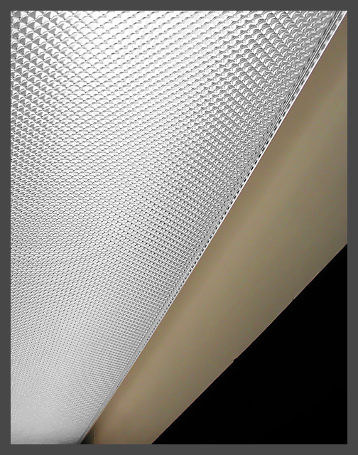
Wow, this is nice and I cant believe it didnt score better. Composition works great. Angles are very dynamic. Framing follows the Rule of Thirds almost textbook with the white dominating and then the tan and black taking up less and less. Its also nice how the hues are similarly graduated, progressing from light to mid to dark, and even the textures almost work the same. The light has an obvious patterned texture, the tan hints at some, while the black is void of any information whatsoever. A few have noted that the shadow towards the bottom is distracting. I initially felt the same, however it does at a certain change to the overwhelming linearity and sharpness of the lines/angles. At this point Im undecided. I do like the photo alot, and I am adding it to my favorites. |







 Add photograph to your favorites
 Add photographer to your favorites

 Photographer found comment helpful.


