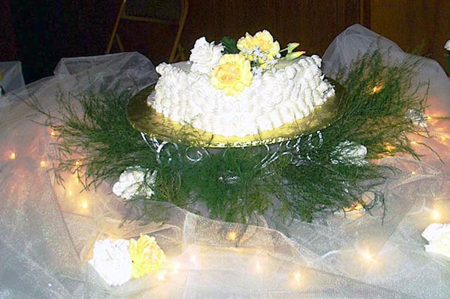
I think this could be a very nice shot. The chair in the background leads your eye away from the centerpiece of the cake and the lighting is a little harsh. Perhaps a cloth in the background or a more neutral one would be better .
that chair in the background is terribly distracting, and the light on the cake is very bright, causing its details to be difficult to see. I would have zoomed in on the cake a little more closely and cropped this so that it was a portrait, not landscape.
A nice photo, but the exposure is a bit imbalanced in places (bit dark in the back, and a little blown out up front). Food photography's really hard to be good at and you did a great job with what you had!
very nice cake and decorations... but it's not sharp enough to be considered for a cover... in addition, more attention needs to be paid to the background. 3.
The foreground on this one is very pretty; I would like the shot better if the backdrop were better controlled, and the photo was even. With the focus on the cake, it would help if it were horizontal in the photo (or further off the horizontal, if the sloping is deliberate) - as it is, it's clear that it angles (since it's so close to the top of the picture) but looks accidental. The folding chair or stepladder (can't tell which) in the background really stands out as well. The same shot might have worked better if you'd brought a chair or two (or something) close in behind the cake, and draped them with a length of fabric in a suitable color (maybe dark brown or black, here) to prevent the background from intruding on the effect.
This has the makings of a great shot, but you might have tried to get a different angle. For instance, looking downward upon the cake would have provided a much better background than the wall and the folding chair. =) Good work, though!
The cake isn't the focus of the shot - nothing really is. There's little of the cake to be seen from this angle. The lighting is quite pretty but the detail on all the flowers is lost and the ferns look quite messy. The background is not very good at all - I can see a stepladder! I doubt this would ever make it onto a magazine cover.





 Add photograph to your favorites
 Add photographer to your favorites


