I have studied your image and have the following to offer:
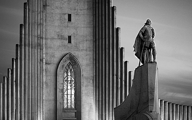
Composition/perspective - this is a very strong composition. Placement of the two main subjects is very well done and follows nicely the rule of thirds. The feeling of depth/distance is created very nicely with the perspective applied. Although the front subject appears raised higher because of the slope of the building, being dwarfed by the facade is an extremely interesting effect. The image appears a bit oversharpened as evidenced by the apparent halo around the statue on the right side - this could also be facility lighting like appears in the background, hard to tell. The rest of the image does not show this. The shape of the building itself acts like a leading line along the top edge which just draws you across the image.
Color - b/w, accentuated very nicely with the natural textures and smoothness. The stone facade and walls are a strong contrast to the sky which appears to just be sweeping on by. The accents keep them nicely separated and working together.
Lighting - very nice combination of time of day - natural light and facility lights. No blown out or really dark areas to be distracting.
Challenge requirements - this might be where this image fell short. I don't really get a sense of celebration from this. Victory, perhaps. But more of a darker feeling for some reason.
Overall/my opinion - a very strong image with excellent composition. Black and white processing is perfect. Not sure about the connection to the challenge, but still an excellent picture.
When I look at your photo, rather than getting a sense of celebration, I get a sense of foreboding. I think it's the black and white treatment. Almost like a scary movie kind of shot - in my opinion. Just my impression.
This would have been great but the whole shot looks "smudgy", like it´s slightly out of focus but I am sure it´s mostly from some kind of post processing. Also, the strong halo around Leif and Hallgrimskirkja isn´t flattering so I only gave this a 5 but I like the tones in the shot, great job on the b/w conversion.
beautiful photo, with its lines, architecture, and shades of gray. the image, with the title, seems to evoke a feeling of mourning or respectful remembrance rather than celebration, however. stunning image. very well done.
this is a great image, but it is somewhat oversharpened as you can see by the outline or halo effect around the statue. nice composition and tonal range 7
Nicely done. I love simple one word titles too. I wonder if you could up the contrast. Maybe not as it is mostly mid tones. I do like it though. Good composition.







 Add photograph to your favorites
 Add photographer to your favorites

 Photographer found comment helpful.


