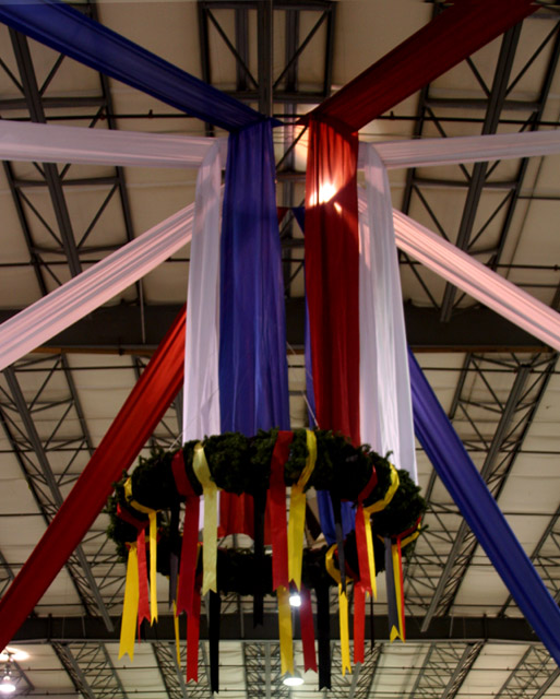
I like the decorations themselves, but I find the lines of the decorations combined with the lines of the ceiling kind of conflict for me visually. Also, the ceiling lights are distracting (although I know you couldn't help those being there).
A bit out of focus and underexposed. I like the composition with the banners, but the lights in the background are distracting. I'd suggest cropping the left and right sides evenly to eliminate the light on the left and cropping the bottom to get rid of the bottom light (even at the expense of cutting off part of the ribbons). Additionally, the color balance is a little off - the white banners have a pink shade to them.






 Add photograph to your favorites
 Add photographer to your favorites


 Photographer found comment helpful.


