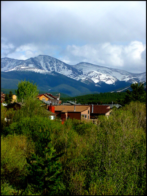
My eye doesnt like how the homes sit right in the center of the photo, and we dont get a clear look at any of the dwellings either. I think it'd look better with the homes removed from the composition alltogether, or getting them more prominent in the frame so we can actually see them.
Tempts me to get my skis out of the garage. Jealous that you can still see snow in June. Great shot. Definately on target for a mag cover. Maybe composed with a little more sky to keep the houses in the lower third ( Leaves more title space on top too)
Very nice... really works for that magazine, with plenty of space for type. I like it... it's not a wow photo, but it works. Not much to say here except that I think it fits... but it's a little far off for a magazine... I think getting below the house would have been nice, and shooting up with the mountains towering over it could have been really cool. That's just my opinion though.






 Add photograph to your favorites
 Add photographer to your favorites


