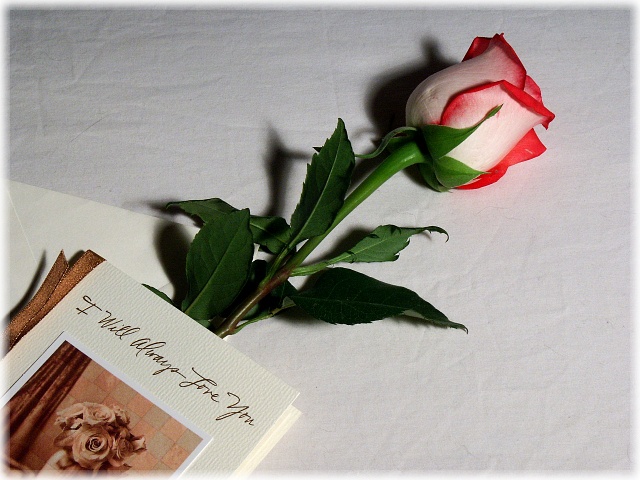
i like the sentiment of this photo. i would have liked to see this shot with softer light and a darker background. the shadow against the light background makes the photo look harsher than the concept feels, and the shadow distracts from the nice form of the rose. another thing that i keep noticing is that the card is in these nice warm tones, and the rose has these nice cool tones, but the two elements seem to stay separate, i think, mainly because of the conflicts in color tone.
this is a very nice image. has a romantic feel to it and wonderfuly done. I would have put another light behind the rose to elimate the harsh shadow that is there. good luck
The lighting in this image is a bit harsh as seen in the shadows. The white background has creases in it that could have been cloned out since this is an advanced editing challenge.







 Add photograph to your favorites
 Add photographer to your favorites


 Photographer found comment helpful.


