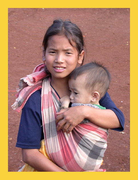
Very nice image. Seems like a NG cover to me! Color seems a little low (increase the saturation a touch or two), but not bad. Focus seems pretty good. Compositionally - I think I've seen NG covers that looked pretty near to this, good work!!! 9 Rob the Swash
Totally hit the spot ... I can absolutely see this on the cover of a magazine. As a photo, evokes a lot of emotion, which is good, plus is well executed. I wouldn't be surprised if you got a ribbon for this one ... (10)
Very much the right style for the magazine. I think this is an excellent image in many ways. Great eye contact and wonderful emotional connection with the subjects.
Feels cropped a little too tight at the bottom - I'd like to see all of her arm/ hand in the shot.
The strong highlight on her nose is also a little distracting.
8
I wouldn't have used National Geographic for this title. I think Life would've been a more suitable choice. A pretty nice photo aside from being a little soft
I think you have made one of the best cover shots for NG during this challenge. The background is not too busy, the expression on your subjects is very 'NG-like'. The only thing missing is the cover text :). Definitely a 10!
Perfect. Just perfect. I love the angle and framing/cropping. The focus and clarity are really good, and lighting is nice as well. Great shot for the NG. If I had to make a suggestion it would be to have included the rest of the girls arm at the bottom, but not absolutely needed. great shot.
some parts of the ladies face is a little bit white areas. IMO maybe image would be better if you crop below her right hand and fill up frame more with their heads. = 4
This is my favorite shot in the entire competition because it actually LOOKS like a National Geographic magazine cover! The only detraction for me is the soft focus, but it still gets a 9 from me. Congratulations - it's wonderful.
This definately looks like a National Geographic Magazine cover. I would like to know who these kids are. Are you sure that they weren't already on a magazine cover? :-)
It's too bad the subject looks slightly out of focus, this really could have been great. I like the subject here, could definitely fit on National Geographic, although I feel shooting down was not the best way to capture this... I think that getting down and shooting up might have been more effectual for this shot. Just my opinion though. Great subject for the challenge.





 Add photograph to your favorites
 Add photographer to your favorites


 Photographer found comment helpful.


