Was just looking at my depressing score for Lighting II when I came across this photo and title...I gotta say that I love it! Made me laugh. Thank you!
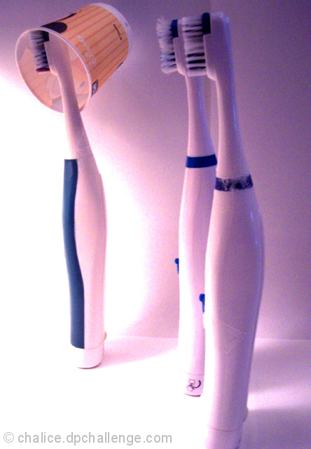
5 - 'Juvenile', but I like it. The title carries most of the weight though in my opinion, and whilst not normally a 'fan' of 'weighty titles', for this Challenge, I make an exception. Criticism; noisy/grainy(?), not sure on the colors, perhaps a diffferent crop/perspective. Mildred facing the others may have also made this better in my opinion. Just noticed the 'remnants' on the fore partygoer, attention to detail (cleaning) would be better. The lighting needs work and overall this shot has a 'snapshot' 'feel' to it, in my opinion, but I like the potential, just wish you gave it more 'attention'.
Love the title and general idea! But not well executed in that it's totally overexposed, which can totally work sometimes but not here! Better lighting would be good next time :-) 4
Aw, I would have given this a 10 for such excellent use of personification (without it being "human-looking"), but the picture has some technical issues. I don't like the blow out highlight and the amount of color noise. Still, an 8 because I like the creativity.
I love the idea but not a fan of the long explained title. The shot is too grainy and has a blue/purple cast to it. Maybe use different lighting. I think there could be more negative space as the crop seems a tad too tight.
I think you ought to have a filter in front of the light source in this pic mate. Would have softened that light on the left. It's too overexposed hence having a load of noise on the remaining of the pic. If I were you, I would have added another light source coming from the top to enlighten the darker parts.





 Add photograph to your favorites
 Add photographer to your favorites

 Photographer found comment helpful.


