I don't know why you went with a square crop on this one. The sides don't seem to add anything to the shot, and those trees that show up a little detract from the composition. It is a good subject and an interesting photo, but I'd have gone with a tighter crop.
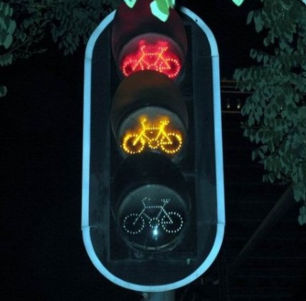
This is a really cool shot, I love the sign... I've never seen one like it before, but Im not really sure if it fits the challenge... so I have to give it a 7.
Hmmm... not sure I really care for this or think it fits... not familiar with the magazine, but I don't think it would work. I just don't think this is a very effective photo.





 Add photograph to your favorites
 Add photographer to your favorites


 Photographer found comment helpful.


