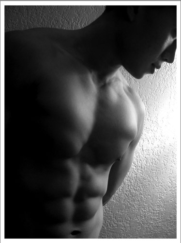
Nice shot for B&W. Very good subject for title (well defined). I'm a little torn on the crop in the face (a little more - a little less maybe? I dunno) The glare spot on the wall is a tad too strong (IMO). Still very representative - 9 Rob the Swash
I would think this photo to be on the cover of a fine arts mag, rather than on a fitness mag, it's just not that style. It's interesting textured wall in the background and dramatic, raking lighting bring out the textures. Only thing I don't like is the blown out highlight on the wall. Well done.
This is a nice shot, although the low key lighting and obvious-wall as background detract from the style of a mag cover. Is his left pec being flexed? There's a wobble in the middle that would kind of indicate so...
The position of the light is very good, just like the POV. I would have chosen a different background though; possible a featureless one to give the photo an even more artistic feeling. Still you did do a very good job.
I doubt we'll ever see anything this artistic on the cover of men's fitness, but people are telling me the same thing about my shot, and I've decided I'm not interested in shooting magazine cover styled shots anyway, so I'm not penalizing for overly artistic shots on anyone else's either. I think this is a great shot, and it does fit your magazine quite well. The lighting and shadows are excelent, I like how only the form of his face is visable, and we don't see his actual face. And those muscles show quite nicely. Great work. 9
I'm going to pretend you meant "Men's Fitness" or something like it.
Although this does show off some amount of the fitness, I am dubious sucha magazine would use a black and white photo or leave the abs in such shade. Usually they're all about in your face pictures that qualify as goals to attainment. The angle/placement isn't the issue, note, except as in regards how hard it is to make out the details on the left side.
Dang, wish I had a stomach like his, oh well, let me get another piece of pizza, where'd those cookies go? ;>)
Seriously, nice shot, good composition/crop..
JB
great work... the lighting highlights the body definition very well here... the softness of the shot is excellent and it also makes a breat black and white. This is definitely one of my favorite shots this week... = 10
Yum! The shadows really enhance the six-pack and the choice of black and white helps with the mood. Having the face not be the main focus works, especially as the magazine is promoting health and fitness. There is enough space around the image for the magainze blurbs and I could really see this on the front cover on Men's Fitness. The only negative is the over exposed area to the side of his shoulder.
Nice work! I like the lighting a lot, it really accentuates the shadows on the body. The background pattern on the wall seems a bit distracting however, a smooth backdrop and/or a shorter dof would have been better. 8
Very good model. I can't say I like the composition, I don't see enough of him. The lighting, especially the glare on the wall is not very good. Focus seems good, and I think it was a good choice to go b&w.
This is good, although I think a smooth background would be better. You can tell this is a wall. Looks like you did well with what you have for lighting. Love the shadows. Love the cropping. Maybe a little better if sharper focus was used.





 Add photograph to your favorites
 Add photographer to your favorites


 Photographer found comment helpful.


