An experiment gone bad. My original office art picture was to be a red-light laptop keyboard hue shifted to blue to produce a bod-like color and try to trick the masses into giving me a good score thinking I was him and not me.
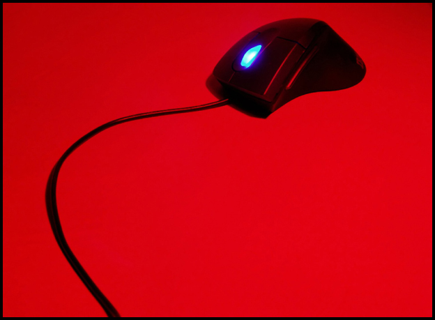
Ok, not really - but after accumulating all of the props I could possibly use for Office Art, I finally came up with this - the blue light really set itself off against the red fill light. I tried this on a mirrored, green and this (grey) surface. The mirror was nice, but the reflection was distracting instead of clarifying.
Hope y'all like it.
Guess - 5.7
Statistics
Place: 19 out of 86 Avg (all users): 5.9636 Avg (commenters): 8.2500 Avg (participants): 5.7143 Avg (non-participants): 6.2222 Views since voting: 1276 Votes: 110 Comments: 15 Favorites: 1 (view)
Thanks for the great comments everyone. I wanted to BE bod-like. :) I guess my score didn't realize it was supposed to hit 6. I thought this was a much better shot than anyone else thought it was. And whoever gave me a 1, that's grand. lol
Almost hit a 6 and beat my guesstimate by .2, so I'll take it. Back to the drawing bod.
Really, at first I thought I was looking at a lamp with one of those bendy necks. Anyway, looking at your title set me straight. The red background with the black mouse is nice. I just don't like the lit scroller. It takes away from your color theme and seems to not fit. 8 Good luck in the challenge.





 Add photograph to your favorites
 Add photographer to your favorites

 Photographer found comment helpful.


