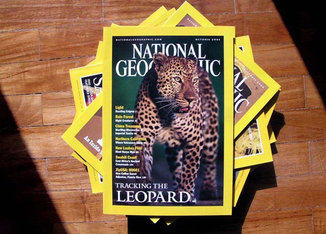
Technically the image is very nice, but the idea of the challenge was to photograph a subject as if it were going to be the cover of a magazine. In my opinion this does not meet the requirements of the challenge. However, I am giving you a 5 based on the good quality of this image.
like an anniversary issue? I like the interesting composition and lighting, its simple, but has impact. Should have arranged it to be in portrait presentation.
I don't think NG would use this picture on their cover; just take a look at their magazine. Therefore I don't think that you really meet the challenge.
I'm not sure this was quite the intent of the challenge. Then again, I suppose I could see something like this on a yearly review maybe. I do like the lighting, though, the shaft of light highlighting the magazines almost feels like reading them is a guilty pleasure and someone has opened a door into a dark room where the view is trying to read them.
This is definately a magazine cover, but I think the point of the challenge was to make your own, not take a pic of one that is already made.
That being said, your focus is way too soft to portray this magazine properly. I can't even read half the stuff printed on this cover. I also don't care for the harsh shadows under the magazines. Subject is too centered, and just doesn't draw my interest.
Does National Geographic show their own magazines on their cover? The use of sunlight and shadow on the floor frames the photo really nicely, though - attractive.
Personally I do not consider magazines to be in a horizontal shape... thats just me though. This does not fit the challenge in any way shape or form. I didn't see the challenge saying take a photo OF your favorite magazine, I believe it was to take a photo that could be the front cover of your magazine, I'm not sure NG would ever put a photo of a bunch of their magazines on their magazine. Sorry bout that, but it just doesn't fit.
Lovely photo, but I think you missed the challenge idea - Make your OWN mag cover, not shoot somebody else's (this is other people's art - site rules and all)
4 Rob the Swash
This is a really nice, well-composed and creatively lit shot. I'm not sure that the challenge meant to actually take a photograph *of* a magazine cover, though... I'll give it a 6 for a technically good shot, however.
I imagine we are going to see a lot of National Geographic shots. I would like to have seen a photo of flora/fauna/people like the magazine has rather than a shot of the magazine. Good attempt.






 Add photograph to your favorites
 Add photographer to your favorites


 Photographer found comment helpful.


