Nikon D70
2005/10/08 09:37:50
Compressed RAW (12-bit)
Image Size: Large (3008 x 2000)
Lens: 18-70mm F/3.5-4.5 G
Focal Length: 70mm
Exposure Mode: Aperture Priority
Metering Mode: Multi-Pattern
1/10 sec - F/11
Exposure Comp.: +1.0 EV
Sensitivity: ISO 400
Optimize Image: Normal
White Balance: Auto
AF Mode: AF-S
Flash Sync Mode: Not Attached
Auto Flash Comp: 0 EV
Color Mode: Mode Ia (sRGB)
Tone Comp.: Auto
Hue Adjustment: 0°
Saturation: Normal
Sharpening: Auto
Image Comment:
Long Exposure NR: Off
Statistics
Place: 58 out of 158 Avg (all users): 5.3794 Avg (commenters): 6.1667 Avg (participants): 4.5345 Avg (non-participants): 5.6308 Views since voting: 941 Views during voting: 383 Votes: 253 Comments: 13 Favorites: 1 (view)
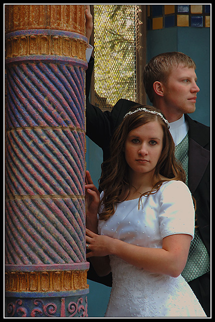
2nd look - I'm not sure if I sense pride, but sense something. Couple might not be perfectly placed, but couldn't stand loosing any of the wonderful column.
7 just because I like it.
The pillar seems sharper than the brides face and the screen window distracts viewers eyes from the bride and groom. Now the positive. Great image layout, Wonderful up and down eyeflow. Colors in pillar compliment skin texture and grooms vest. Just a glimse of ring on brides finger is a nice touch and like the look on grooms face-as if hes thinking of that lost bachelorhood. Great great job overall. Congrats
okay, been trying to work out what bothers me. the composition is great. the poses are great, the expressions work for prideful intentional separation (anger, argument..) But none of those work with the wedding attire. This should be a happy occasion and these two look upset.
This is an unusual wedding portrait. They look like they don't really belong there.The light doesn't showcase her face at all. It doesn't have a very romantic sense, as the couple doesn't seem "connected" and he's looking off into the distance. If it were just him alone, leaning on the post, with that far away look, I think I would like it. The colors seem a bit distracting and busy with the various textures of the column and the shiny metallic gold up by his head. It would make an interresting study by itself without humans in the shot. A high contrast black and white might work better. If he were looking into the camera and she were leaning back into him, it might evoke more sense of solidarity yet not be the typical cheesy wedding shot.






 Add photograph to your favorites
 Add photographer to your favorites


 Photographer found comment helpful.


