*Critique Club*
Well, I have not heard of this magazine, but I assume it is a nature magazine? Maybe a photography magazine? I don't read a lot of magazines to know what kinds have sunsets on the covers.
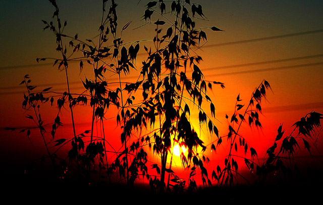
The thing that bothers me most, and you already know about it, as you stated in your comments that you will be editing them out, is the powerlines. I think that they are a distraction that harms the photo quite a bit. Enough of that though, you alredy know.
The silhouettes are nice. I do wish though that they weren't cropped off at the top, and I also wich that this were a vertical crop instead of a horizontal crop. This would have been more appropriate for a magazine cover, and also would have allowed the weeds to have not been cropped off at the top.
Focus and clarity appear to be really good. Lots of times we see blurry weeds due to windy conditions, however, I don't see that here. You have done a good job.
Other than that, the colors are really good and like the sunset very much.
~Heather~
I don't know what VIA is, but t his is a lovely magazine cover. The colors and sillouette work very nicely together. Are those power lines in the background?
What planet did you visit to take this glorious photo?! I love it! You must live in a smoggy area to give such a red, particulate-filled sunset. Beautiful.
I like the sillouette effect, the sun falls off a little too fast, we neeed to see more color in the edges of the frame. Also desperately need to get those power lines out of the shot!
Personally I do not consider magazines to be in a horizontal shape... thats just me though. Some great colors in here... but it looks tilted... also are those powerlines running through the photo? That's really distracting... I hope you didn't look directly at the sun.






 Add photograph to your favorites
 Add photographer to your favorites


 Photographer found comment helpful.


