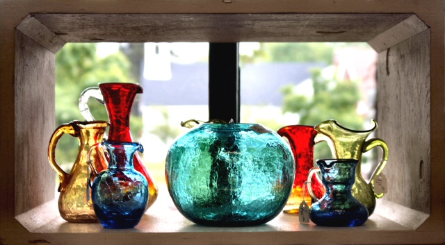
I think that there is too much contrast between the inner walls and everything flaring outside..... my attention is drawn to the background.... Good idea and balance of colours and sizes..
This photo looks like a water color with the sharp translucent colors of the bottles and the Money like backgroup. I like the use of the window frame as a frame for the photo and the composition of the color with the blue flowing through the bottles.
Personally I do not consider magazines to be in a horizontal shape... thats just me though. This is very pretty how you put it in front of the window kind of lightingup the glass. This might have been a cool picture for the glass challenge. I like the photo, as just that a photo, I don't think it would work as the cover of a magazine for various reasons, including the shape of the photograph, and I couldn't imagine how it would ever fit a vertical page. Although I like the photo I have to count down for my belief that it doesn't really fit the challenge. Sorry







 Add photograph to your favorites
 Add photographer to your favorites


 Photographer found comment helpful.


