*Critique Club*
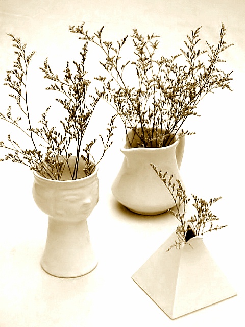
The very first thing that draws my attention in this shot is the fact that you have cropped the left of the photo way too tightly. I think that the left of the photo outweighs the right because a)there are more of the plants going up that side of the photo and b)our attention is drawn there by the cropped tips.
The lighting in my opinion is really good. I like the white on white with very little other 'color'. Also good for the focus.
The focus is nice, and I like how we get detail in both the plants and the pots. My favorite is the triangle.
I am not familiar with your magazine title, however, I think that it sounds like it would work on the cover of a magazine with that title.
Overall a nice job.
~Heather~
*Final Hours Critique*
If my comment is brief, it's because the Magazine Cover shots are going to be taken off the CC list tonight at midnight, and I can get to more of them, using less words. Figured even a brief comment is better than no comment at all.
Perhaps all of the branch stems should have been included, otherwise an excellent image, even the edges of the vase blend into the background, hot in the right place. Fantastic for the title.
Nice - I like how stark this is, and the use of white on white. The edges of the plants are almost too sharp, but it makes a nice, lacy effect in this context. (Was that a sharp filter, or just a really good mingling of lighting and subject?)
Lovely coloring and lighting - it might even be better if perhaps you only had one of the figures - keeping with minimalism for this shot. But technically very well done!
You could have a little more of the left edge of the photo in the shot. The area where the greenery is touching the left edge draws your eye to it. Perhaps a slightly darker background as well would have shown the subject off better. Great compostion and subject matter.






 Add photograph to your favorites
 Add photographer to your favorites


 Photographer found comment helpful.


