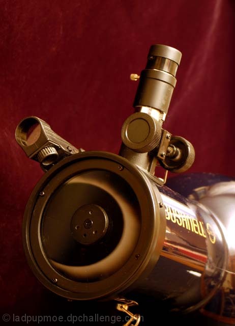
i like the reflection in the end of the lens. Very nice. Wish there was a bit more light though, for some reason it seems a tad too dark, or maybe its just not enough contrast? I'm not sure..I'm struggling to find what my hesitation is here.
Took me a minute to realize that the thing in the center was an 'eclipse' and not just an annoying glare. I still find it to be a bit distracting from the telescope, which I find to be much more interesting. Focus and clarity look good. I think it's a nice shot to be on a magazine. light glare to the right is a bit distracting, expecially since the sun's suposed to be all covered up by the eclipse. :)
This is a very clever shot. The only thing that I would like to see different is the glare near the base of the telescope eliminated. Great composition and framing.
The bright white behind the BUSHNELL on the telescope is very annoying, it totally draws my eye from the main point to it... I think I would have used a lighter colored background... because the wine color is almost similar to the telescope, and it makes the telescope blend in. Watch your reflections.





 Add photograph to your favorites
 Add photographer to your favorites


 Photographer found comment helpful.


