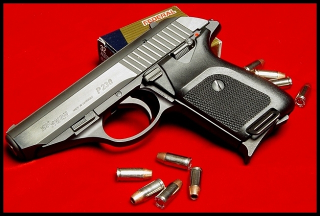
Composition: I am one of those that thought entries should have been in portrait, but I admit that pictures in landscape are used for covers also. I think yours is cropped a little close , especially on the left side. Also the ammo box looks just a tad worn, this shows on the flap on the left side. Other than that it is a very good composition.
Technical: This being a difficult subject you have done a commendable job. I see only a couple of things that distract from its quality. The bullets appear to be out of focus and the gun is a tad bright along the slide. I think they (Guns & Ammo) would have toned it down some to make the name stand out more, after all sales are what keeps magazines going.
Challenge: You have met the challenge with this one, but I am confident that it scored lower than it might have if it were in portrait.
Suggestions: I have noticed that most gun related magazines also show the results of the topic gun. Such as targets with a close group or something like that. You might have considered including this type of prop to boost the story line of your photo. You have done a nice job on this photo, so as you say "Keep Shootin."
Disclaimer:
Bear in mind that I am here to learn, just as many others and any comments that I have made are not intended to be offensive in any way, and are only constructive criticisms. If you wish to comment or discuss this critique please feel free to do so at any time.
Thank you,
Dick Pattee (Autool)
Autool@attbi.com
You got tripped up by the one color bg=bad thumbnail thing this week. I hope it's not affecting your scores like it did mine last week. Sucks when it does. Great picture, excellent composition and crop. 9
I was going to do this too, but never got around to shooting. The gun or the camera. This is a good shot to be on a mag. cover. My only suggestion would be to have a little more space to the left of the tip of the gun. Cut it a little too close there in my opinion.
Great choice of colour. Very effective lighting, brings out the cold texture of the gun. I can't help but feel that this glamourises guns, which I have a problem with here... but I've not allowed this to affect my score. 8
Personally I do not consider magazines to be in a horizontal shape... thats just me though. I like the red background you put this on... it kind of makes me think of blood but it seems fitting for a gun. Man, I would not want to be hit with one of those bullets? Are those the ones they call "hollowtips"? Whatever they are I'm sure their lethal. I'm sure this could be the front cover of a magazine.
Nicely done. I've done quite a few firearms shots, myself, and I know it can be difficult to get them to look very "clean" and handle reflections and shadows and whatnot. I like your choice of background as an eye-catcher. Maybe a little tight on the left side of the frame, but overall quite nice.






 Add photograph to your favorites
 Add photographer to your favorites


 Photographer found comment helpful.


