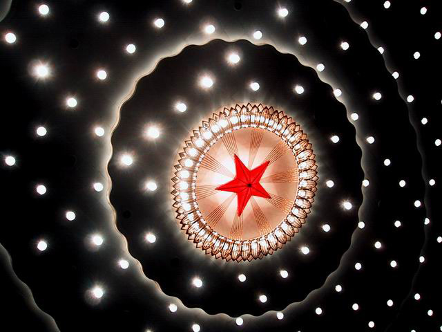
Composition - Interesting abstract type shot. Definitely has some appeal as a more modern art type piece with a nice focal point and the blackness broken up with little dots of light. There are 2 problems with this picture IMO. I think with this kind of photo, are you at any disadvantage to get it into portrait format, which would be more conducive to magazine covers in general? And secondly, this picture looks like an illustration as much or more than it looks like a photograph. There are no reference points to indicate what is up or down, left or right, so why not put it portrait? you could flip or rotate all you like legally to achieve this quite simply.
Technically - This is very sharp and well taken. I like that some of the light circles are overexposed, but not all of them. This was good technique used with this photo and favorable angles to accomplish the partial overexposures.
Overall - I don't know this magazine. I'm not sure what the cover would even look like. This is a cool picture. You almost have to sell people into believing its a photograph. Flipping it portrait would've been a logical thing to do, since the greater majority of magazines that I know of are in portrait format. Very interesting image that has a lot of appeal, but maybe not the greatest for this challenge. Good luck with future challenges. - Bob
Personally I do not consider magazines to be in a horizontal shape... thats just me though. I have no clue what the theme of Star Light Express Magazine is... I can't seem to find it on Yahoo. I'm not doubting that it's a real magazine, it's just I have no way to judge whether your photo would be good for the cover or not. Sorry.







 Add photograph to your favorites
 Add photographer to your favorites

 Photographer found comment helpful.


