*Critique Club*
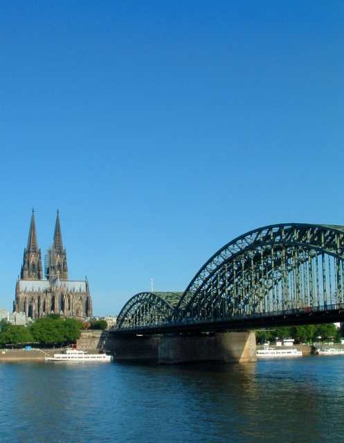
I see a really nice angle and framing/cropping. I think this is a good shot of a really nice looking city. The Sky is beautiful. Not white and blown out like I see so many skies.
Your focus seems just to be a little bit soft. I'm not really seeing a crisp area of focus. It's not BAD, but I would just like to see it a little sharper to bring out details in the bridge and building.
I do like how your bridge leads our eyes right into the photo to the building.
I'm one who likes the negative space at the top. I think it's a lovely blue, and would leave plenty of room for a title, and then still leave some negative space between title and subjects.
The lighting conditions look to have been very nice for this shot. Isn't it very nice when the weather cooperates for a shot?
Overall a nice shot, which I could see on the front of a magazine.
~Heather~
I think this one needs to focus on one of these great pieces of architecture. both of them is a little cluttered and tough for the viewer to choose what to look at.
Really a beautiful image. My only complaint is there is too much sky above the focal point. Assuming you were leaving room for a magazine title, it would still be a bit too much sky.
This is a beautiful shot - it would make a nice calendar photo. I'd like a couple of puffy white clouds to balance out the blue sky, I think. But overall very lovely.







 Add photograph to your favorites
 Add photographer to your favorites

 Photographer found comment helpful.


