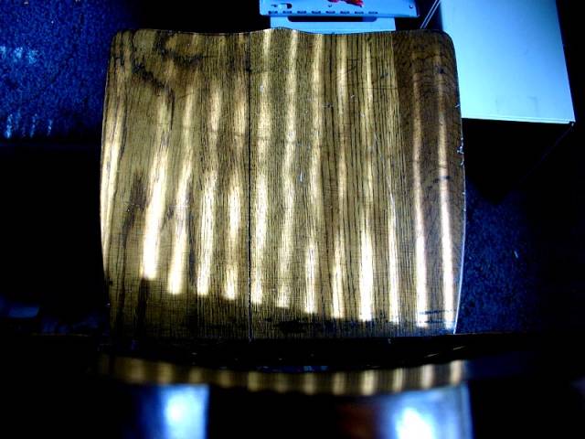
I think the angle detracts from this somewhat. Was there a way to get a more interesting shot, maybe from the side? It may have also looked kinda cool to turn the chair 90 degrees so the shadows were perpindicular (sortof) to the grain of the wood.
The lighting brings out the texture of the chair back nicely. I wonder if a portrait orientation would have gotten rid of the dead space at the edges, though.
I need more of a visual explanation to be able to appreciate this. Was there a better angle for this shot? The junk on the floor detracts from the photo as well. **DAYS LATER** The more I see this the more I like it. It's a nice image...colors and lines are great...I like how the shadows follow the grain of the wood. It almost looks like it could be some sort of exotic wood with zebra grain. I'm bumping my original score up. I've changed my mind...everything is great except for the clutter on the floor! : P
This would be improved (me thinks) if the books and notebook in the background were removed. It doesn't give the appearance of a set up shot when such things are showing.
Had to stare at this one! It's a chair back and vertical blinds. The extraineous blue colors confused me. Very bright, vivid shot. I think I would have liked this better if the bottom was cropped (two blue flares...), the top (a monitor???) and the sides, but keep the chair seat if possible! Photo 8 Creativity 7 Shadows 8 total 8






 Add photograph to your favorites
 Add photographer to your favorites


