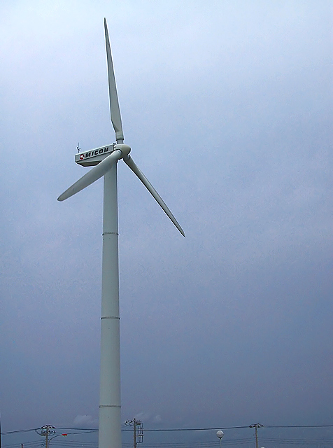
Thanks to everyone who looked. I included the power lines because it was so relevant to the topic of power. Maybe as an individual photo the power lines should be excluded, but for this magazine cover I thought they should stay. And I agree that the sky really sucked, but I was power-less to change it at the time.
Not bad. I would have cropped out the botton row of electrical wires/poles to really emphasize the "eco" part of your title. If you cover up the bottom portion with a piece of blank paper to expose only the windmill, you'll see how much more emphasis this will give the windmill and the surrounding canvas of blank sky. 8.
I like the idea here, but I would crop of the lower part of the photo to get rid of the power lines. Other than that small knit, it's a very nice entry :)
Have we seen this windmill before? Or just one similar to it? I like this, I could see it as a cover of a magazine. The colors are somewhat dull but I think it fits this photo well. Plenty of room for the type, I could see the Eco to the left of the windmill and the Living to the right... or something like that. Not extremely interesting, but it fits the subject and works well. Good luck.






 Add photograph to your favorites
 Add photographer to your favorites


