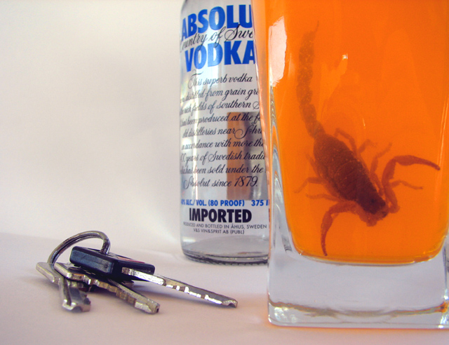
This is the first pic I got from Basic Editing my Challenge submission pic. [thumb]237083[/thumb]
This is called True because these are the true colours of the picture, with a little saturation bump and auto curves.
This is what I had pictured in my head when setting up for this picture, particularly the contrast between the orange and the blue of the Absolut bottle. I am proud of this picture and while the final result isn't my favorite, it is the picture I am proudest of because it is exactly what I wanted.
Except for the strong reflections of light and the camera showing in the glass.
Please let me know what you think about this picture, particularly compared to the other versions.
Way better, gave you a 4 on the challenge do to the colors being sat. and not true colors. This one much better, the orange goes well with the blue, (oops complementary colors ?), would gave it at least a 6 to 7 score.........nice job




 Add photograph to your favorites
 Add photographer to your favorites

 Photographer found comment helpful.
