What a comment on the controversy of different complementary colour systems!
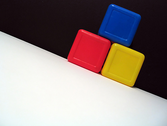
This is a very striking composition, and I like the energy of the diagonal lines. Too bad that the block that's supposed to be orange is actually too red to get the complementary effect. What's demonstrated is more of a primary colour scheme, which pumps its own energy into the composition.
Regardless of the score, I think this is a fine photo, just doesn't say what the title suggests!
The orange block shows up red to me. Don't know if it's my screen, or the proximity to the bright yellow. Nice, clean shot - did you want to make both color camps happy by using both the red and yellow with the blue?
On my monitor these are blue, red, and yellow. These are primary colors not complementary. I like the angle and that the blocks are sitting where the black and white meet.







 Add photograph to your favorites
 Add photographer to your favorites


 Photographer found comment helpful.


