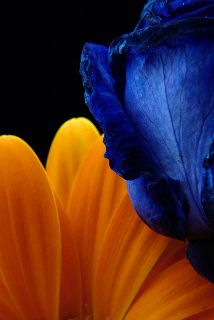
Orange gerbera and dyed blue rose. A heavy crop. These are the some of the riches colors I got in shooting for this challenge. Too much in the background in the other and these just concentrate on the hues and tones of the two complements...with a little bit of texture and shape thrown in to, hopefully, make it interesting.
Post: Crop....Layer adjustments for levels, brightness and contrast, hue and saturation (all 3 at 50% opacity). USM. Resize. USM.
Considering the focus problems on this I am quite happy about the finish. Guess I shouldn't have used that 10x closed up filter. Liked the colors of this a lot and was glad to see others did as well. Here is the original, downsized and USM only:
Here is another version to consider: I think the orange in this latter version is no where near as rich though the focus is a bit better.
Statistics
Place: 15 out of 318 Avg (all users): 6.3862 Avg (commenters): 7.7333 Avg (participants): 6.0678 Avg (non-participants): 6.6797 Views since voting: 1661 Views during voting: 345 Votes: 246 Comments: 17 Favorites: 1 (view)
Like this photo, although I wouldn't have any empty space in the upper left, I think I would have put another color their, maybe a red flower??? One of the better photos in the challenge though.
Strong focus on the petals of two different flowers. Complementary colors of blue paired with the orange/yellow is vibrant and rich in tones. Love the textures seen on the petals of both flowers for it gives the eye an added interest to look at. I was going to say that I would have prefered the two flowers to have been of the same kind so that the imagery of them being paired complementary colors would be stronger, but I do think this choice works. The reason? Different colors found in differnt flowers with different textures in the petals adds interest





 Add photograph to your favorites
 Add photographer to your favorites


 Photographer found comment helpful.


