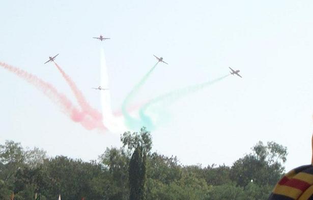
too washed out. what ever that is in the bottom right corner is a distraction and so are the trees. I think you could have cropped all that out leaving just the sky and planes then upped the colors and it wouldn't have looked so snapshotish.
For me, the red, white and blue are complementary, but the photo seems a bit washed out. Also, I think if the shirt in the lower right were cropped out it would put the focus back onto the planes themselves.







 Add photograph to your favorites
 Add photographer to your favorites


