Complementary colours are pairs of colours that contrast strongly when compared to each other.
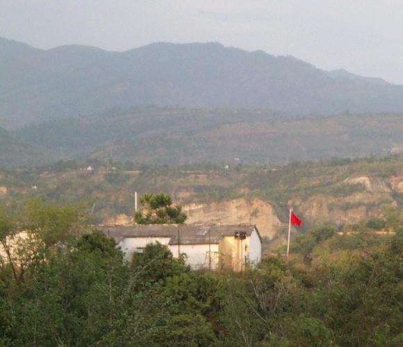
The red of the flag is lost against all the blue toned background. Your shot would have been a more successful demonstration of complementary contrast if you had cropped tight around the red and shown some of the green foliage around it as contrast.
Looks like a prison camp seen through a telephoto! I like the red minimalist subject, but I think it coulda used some more saturation and maybe a bit sharper.
Composition had potential here. The haze lends a desolate quality to the photo. Since your subject (according to the title) is the flag, I feel it should be in focus.
too flat for my tastes. if your main comp colors are the red of the flag and the greens of the trees, it just doesn't have as much "omph" as some of the other entries.
Interesting picture. Like the rolling hills with the mountain range in the back. The red flag seems important since you had it in your title, try bringing the focus in on that more. It just seems so distant.
Nice concept. If the weather wasn't so humid (or less pollution), the overall photo would be more presentable. Also, getting in closer to the flag might help a bit.
Noisy. Composition is not talking about colors. It is more to antidrug intelligence photo of potential narcomafia center. Why red flag? Because lot of drug traffic is related with rebels and revoliutionists :)





 Add photograph to your favorites
 Add photographer to your favorites


 Photographer found comment helpful.


