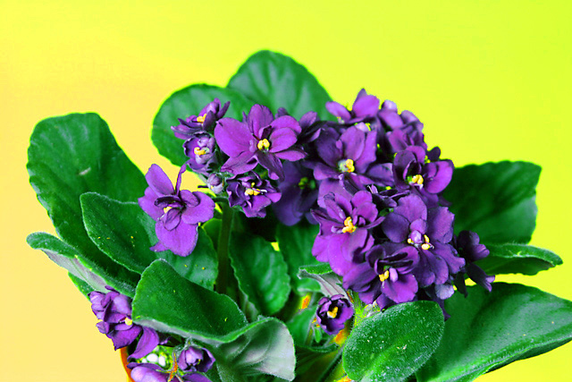
The complementary colours I see in your image are yellow/violet, but the addition of the strong green from the leaves of the plant change the effect of the complementary colours.
Complementary colours are pairs of colours that contrast strongly when compared to each other. The main colours in your image are yellow and violet.
I think your photo would have been stronger if you could somehow have de-emphasized the green or else shot the photo with just the blossoms and not the leaves.
Brilliant bold colors on the yellows, purples and yes, greens. The lighting is very good. Techniqually good but the composition is weak. The only thing that weakens the strength of the shot is that the straight eye level shot does not hold the eye's interest for long. It has no 'umph' or pizzaz that makes it unique. A change in shooting angle (i.e. a side shot with the camera looking up at this floral arangement) can add a whole new dimension/ a new way of looking at this flower that will make the viewer stop, stare, and smell the flowers.






 Add photograph to your favorites
 Add photographer to your favorites


 Photographer found comment helpful.


