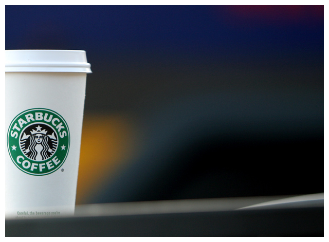
I don't understand the title. Nice exposure on the cup, although it appears that at the left edge the highlights are blown - might just be a result of the white border, which might have been better left off. I like the fuzzy colorful background. What is the whitish fuzziness in the foreground, though?
I love the bokeh and the indistinct contour along the bottom edge. The only things I'd change would be to (1) remove the white part of the border (or make it a less pure white - it creates too much tension between it and the off-white cup) and (2) alter the focus on the cup (either softer or tack-sharp focus would work, but as it is this looks just far enough from focus to look unintentional). I love the subtle interplay of warm and cool colors in the background. I don't normally go for anything that consists almost exclusively of a company logo, but you nailed everything else so well that I can't help but love this. This is easily my favorite image so far in the challenge.
My favorite stopping place every morning. :) I think this is a great shot. Simple and just enough color. Might have tried to crop out the white line near the bottom, but just my opinion. Still love the setup and shot Good luck 9
I like the colors and soft blur of the background. I don't really understand the title based on what I'm seeing in the photo, titles don't concern me a lot though.






 Add photograph to your favorites
 Add photographer to your favorites


 Photographer found comment helpful.


