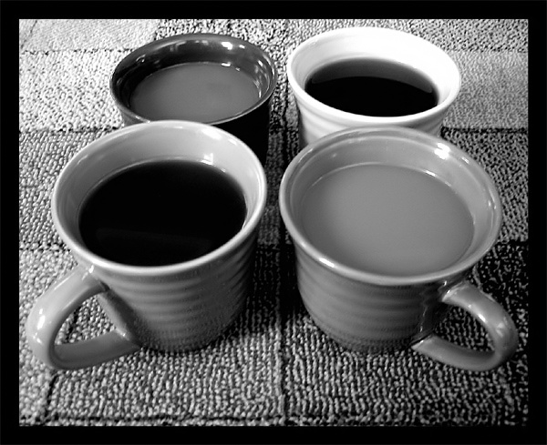
The B&W treatment does a good job of highlighting the texture in this shot, but I'm afraid that a lot of your texture is in the background, so your intended subject looks relatively flat and uninteresting. The thick border does a nice job of emphasizing the subject. The different shades of the coffee and the contrasting cups are a nice touch, but I think that it'd be more interesting if you added something to the cups to give them interest (e.g. a sugar cube floating in one, a sprig of mint in another, a cinnamon stick in the third, and a spoon in the fourth). The different cups and colors suggest similar variety in their users; seeing the hands of the drinkers might make this an interesting character study.
i love this concept! every time i look at this photo, though, i want to reverse that rear left cup with the front left cup, so that the shorter one appears in front...guess it's my OCD peeking through! : )
This is a brilliant shot. I love seeing intelligent use of contrast in black-and-white photographs, and you've certainly given me something about which to be pleased. Great work!





 Add photograph to your favorites
 Add photographer to your favorites


 Photographer found comment helpful.


