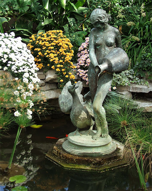
The predominant colours in this photo are green tones. To demonstrate complementary contrast, you would have needed more red-orange colours in the flowers. However, if you had changed your angle and shot the goldfish with the bronze of the statue or the green waterlily leaves, you would have had a fine demonstration of complementary colour contrast.
Wow this is a gorgeous photo, but I really woulda waited to use it in another challenge, because I think its more the composition than the colors which make this photo good.





 Add photograph to your favorites
 Add photographer to your favorites


 Photographer found comment helpful.


