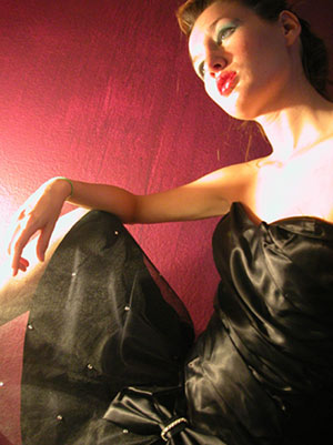
The composition looks a little off (don't like her head to the side like that to fit in the frame), but it does allow room for text which is good. Is this shot through a window? There seems to be a reflection in the lower left quadrant. The lighting is also a little harsh and uneven (blown out highlights on the neck and leg). (2)
This is interesting... What a weird dress! I was going to ask about the lighting then I realized the dress hadd some kind of a mesh thing on the bottom that was catching more light. The light on the hand is a little akward though. I would have like a little more room at the top for type, but it's not too bad. This is ddefinitely different.
Lighting is harsh. Thats the main, maybe only problem here. Composition works really nice and its cool how this lady almost looks like a manequin. Is she?
The lighting on this is so harsh - the glare on the left side is distracting, as is the fogging from it, and it looks like you used a plastic doll from both the pose/angle of the head and the lighting (though I find it harder to believe a doll could achieve that angle of the wrist). I'm not sure what the background was, but it looks like it was at an angle - streaks/striations are visible on it.
Ok. It is taken through a window. Light is very harsh but you could not control that. I do not know how you could make this turn out wonderful. I do however think your angle is very good.
The blown out hotspots are a problem for me in this shot. Espcially with fashion photography, to be up there with the best of them doing magazine covers, lighting is so important. However, the model, her dress and the pose are all extremely good. I'd try it again with more diffuse light.






 Add photograph to your favorites
 Add photographer to your favorites


