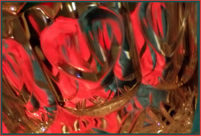
I'm not sure I agree that this is "too blurry". As is, I think it has the right ingredients for an abstract. I'd have to see how it came out sharp to see if that was better!
You could play a bit with this shot to possibly make it stronger. Since color is the primary focus of this abstract, perhaps you can try adjusting the white balance or levels so that the crystal does not appear toned (it has a yellow-tan tone on my monitor), and let the shape of crystal alone serve to texture the greens and reds in the background (along with some perhaps stronger greens which can also be adjusted in PS).
I can see the red and green - those definitely being complimentary, but the photo appears out of focus, and compared with other entries in this challenge doesn't have the same "wow" factor.
while this image fills the criteria of the challenge I feel the image is too blurry to focus on any part of it. It actually made my eyes go funny looking at it. However, I am sure there will be others who love it. Sorry I couldn't be more positive






 Add photograph to your favorites
 Add photographer to your favorites

 Photographer found comment helpful.


