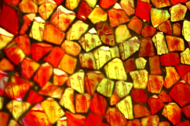
interesting view, I wondered how this was done..... Excellent intricate design. Overall field composition is superior. Score 7 - and maybe some points off for comp-colour req....
The complementary colour for red is green and for yellow is blue-violet. Your photo does not demonstrate complementary colour contrast. Nevertheless it is an interesting abstract arrangement of bright colours and interesting textures.
I can't see any complementary colors in this, and I am having a difficult time understanding what I am looking at. If abstract is what you are going for, you have succeeded. I do like the shades of red, orange, and yellow. This would make a great fine art print.





 Add photograph to your favorites
 Add photographer to your favorites

 Photographer found comment helpful.


