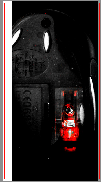
Hey, that's my mouse!!! It's not very clear at the bottom (can't read the last numbers), so I wonder if it may be lighting causing the problem. And there seems to be a bunch of specks of something all over the photo. Is it taken through the bottom of a glass table?
Fits the topic, but all the weird little white speckles all over it distract greatly, and the extreme contrast makes it hard to see. Good concept, bad execution, imho. 4.
In all fairness let me see if I can do this constructively. In my opinion, the subject matter, the underside of a mouse is not overly interesting. Maybe if you had cropped in closer on the red portion of the image, provided it was feasible and without too much pixelation. That part of the image is actually more interesting than the rest; it actually looks like a cyclops - call me crazy. My suggestion I think would really highlight the abstract nature that you were trying to convey much more. Also I think the border is a little overdone. I do however like the red pinstripe with the grey as you have it on the right side. I'd loose the white. Also maybe if you had tried cleaning up the image with unsharp mask or Neat Image. Hope this is a fair assesement. Cheers.





 Add photograph to your favorites
 Add photographer to your favorites

 Photographer found comment helpful.


