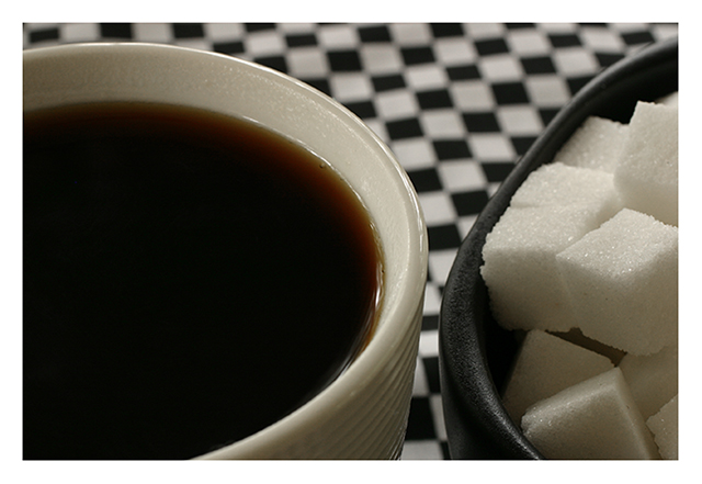
i like the pairing of the sugar cubes and the squares in the background. i also like the reversal of colors in the sugar cup and coffee cup. there's something about the composition, though, that feels a hair off. wish i could articulate that better...maybe it's the proportion of cups displayed in the shot?
I think a "half-and-half" (no pun intended) composition might have proved more interesting (i.e., having had each subject take an equal amount of space).
Detail of sugar is really good. The use of black and white checks to mimic the b&w cup and bowl was very creative. The squares match the sugar cubes nicely. Felt it took away from the coffee, though. Still, I understood where you were going with it, but I think you might have enhanced the wrong subject with your composition.





 Add photograph to your favorites
 Add photographer to your favorites


 Photographer found comment helpful.


