Challenge:Office Art (Classic Editing) Camera:Sony DSC-F717 Location: Pleasanton, CA Date: Jun 6, 2003 Aperture: 2.0 ISO: 100 Shutter: 1/60 Date Uploaded: Jun 6, 2003
Looks like a Savin
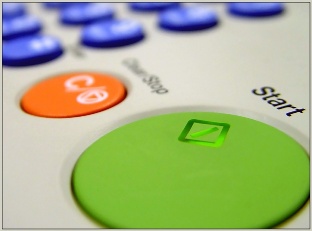
Composition - Nice and colorful. I think there are a few dead spots though where there are no buttons. I was thinking maybe taking this from the number side would've worked out a little better. What do I know though? You do have a better array of colors from this end, and they are brighter.
Technical - With only a very small area of this actually in focus, and part of that area not having anything there, it might've given the illusion that more of it was in focus if some of the number buttons were in focus. Good use of shallow DOF, but maybe just a little too shallow. I think at f5.6 or so you could've put the whole green button in focus, considering you had the light to do this, and/or a tripod because handholding at 1/30 sec or 1/15 sec is definitely tough to pull off.
Overall - For what it is, I think you pulled off a pretty good pic. A little greater DOF to show more of the "start" button in focus I think is the only thing that would've made much of a difference to this pic. Nice work. Good luck in future challenges - Bob
Ahhh, fax machine face. Lets see...I know this seems a little nit picky but I would have liked to see the green button more in the bottom corner and could have gotten just a little more blue at the top. I like your use of DOF. I really like the colors. They are vivid. 8 Good luck in the challenge.






 Add photograph to your favorites
 Add photographer to your favorites

 Photographer found comment helpful.


