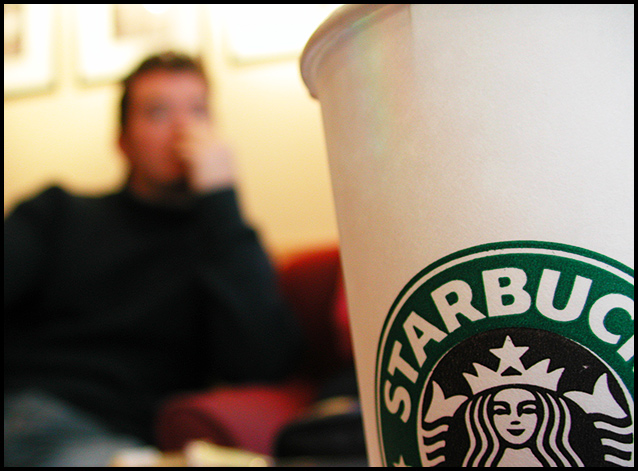
I'd like this a lot better if I had a stronger impression of what the figure in the background was like. While the person does make this more interesting, the extreme emphasis that the DoF places on that ubiquitous logo makes this look more like a piece of Starbucks promotional material than a photo most people would choose to look at. The logo is so large that I think that the DoF could be placed a bit farther back in the image and still keep the text legible. If the focus fell on a pencil poised over a piece of paper, a stack of textbooks, or a pair of reading glasses on the table in front of the figure this would have a lot more character.
the more i look at this photo, the more i like it. i like the range of focus and composition, and i really like those warm colors in the background contrasted against the green and white.







 Add photograph to your favorites
 Add photographer to your favorites


 Photographer found comment helpful.


