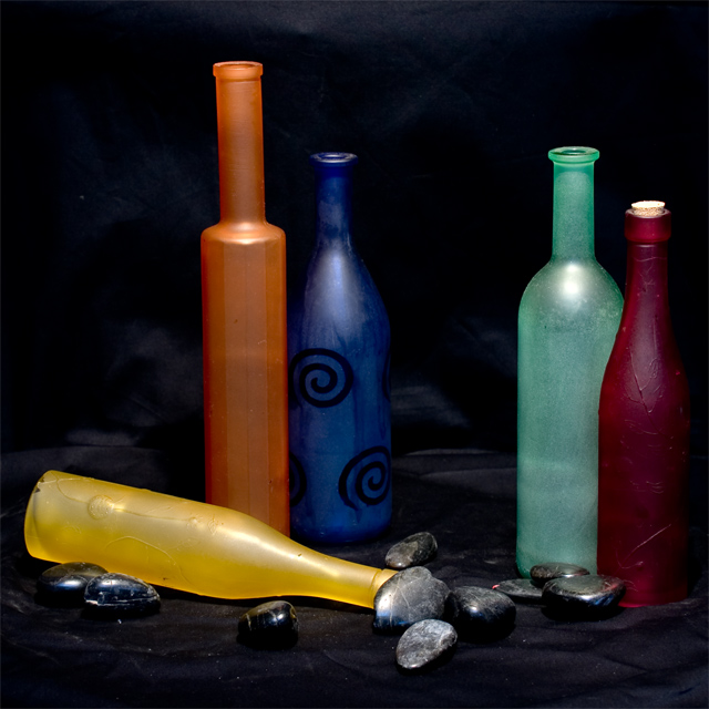
Unfortunately there are too many complementary pairs here to demonstrate the effect of one colour contrasted against its opposite. If you had selected, say the blue bottle with the spirals and either the yellow bottle or the orange bottle, you would have had a good demonstration of complementary colour contrast. Nice blue tones in the background and in the rocks would have added to the effect.
If the cloth they were sitting on were purple, this one would be perfect for me....
Okay, now that I have looked at it on a different monitor, that cloth DOES look purple.
This is almost great but I don't know why, maybe it is because not one of the bottles stands out by itself and they are in the many parts one picture. Not bad.
At first I was going to say that there are too many colors here when the title of this piece and the pairing of some of the bottles struck me. Very clever! Yellow is missing is paired complementary partner purple. Lovely idea on the composition, however the execution calls for some improvement to really make this image "pop" off the page. The colors on the blue and orange bottles are perfect they are both vibrant and the hue shades compliment each other well. However the red bottle and green bottle pairing doesn't work quite as well. The green bottle is a shade too pale standing next to the vibrant deep red bottle. A richer green hue would have been a better pairing for that red bottle. Next I don't know why you include thos black rocks for they do nothing for the composition - in fact they detract the eyes attention from the main focus which are the bottles. Lastly the black background needed to be a deeper, flat and darker hue (there are variations in the black hues such that some 'highlights" appear in the cloth) so that it would make the color hues of these bottles literally "pop" off the page.






 Add photograph to your favorites
 Add photographer to your favorites

 Photographer found comment helpful.


