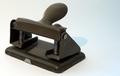
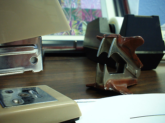
My stapler and staple remover square off over the fate of the helpless paper ...
Ambient fluorescent lighting, camera hand-held resting on the desk in macro mode. Resized to DPC limits -- no cropping.
Slight tone adjustment and two light passes with Unsharp Mask.
I was using Isaac's camera and can't figure out the exposure data from the EXIF, but it's an auto-everthing camera.
Statistics
Place: 69 out of 86 Avg (all users): 4.8889 Avg (commenters): 5.4000 Avg (participants): 4.7368 Avg (non-participants): 5.0588 Views since voting: 1691 Votes: 108 Comments: 13 Favorites: 0
*Critique Club*
This is very cute. I like the concept very much.
The angle and framing/cropping seem to me to be just fine. I think having the stapler coming out of the bottom left is good.
What is bothering me here is the background. Mostly the tape dispenser. It is right in the middle of the 'action'. I wonder how this would work sitting on a desk with just the wall being the background...
~Heather~
I think I rather like the natural business of the background, but it is poorly (and hurriedly) arranged. The main changes I'd make would be to have the other office items forming a ring around the fighters, facing in and focusing the action, and to have a stack of forms that aren't so bright. If I had known this little camera would capture the detail so sharply, I'd have partially extruded a staple to make some cool fangs.
I'm at this place three days a week, so it shouldn't be hard to try a do-over, maybe with my camera this time. Thanks for your comments!
*Critique Club*
This is very cute. I like the concept very much.
The angle and framing/cropping seem to me to be just fine. I think having the stapler coming out of the bottom left is good.
What is bothering me here is the background. Mostly the tape dispenser. It is right in the middle of the 'action'. I wonder how this would work sitting on a desk with just the wall being the background. That way it is still in a natural looking environment, but not too busy as with this background.
The white paper in the bottom right is a little bright. The rest of the shot is dark, so adjusting brightness would hurt this shot. The only 'fix' I see would be to adjust the actual lighting around the subjects.
Focus and clarity seem good to me. I think that the detail in both subjects is good to show the competition. You captured the pointy prongs on the remover very nicely.
Overall nice.
~Heather~
I like the focus and the angle of the shot. In my opinion the envelope ? is too white and bright for the rest of the objects. I would rather see just the desktop or maybe a pen.
Nice picture, nice concept, stapler vs remover. I also like that its not done on a kind of studio backdrop... this way gives it a much more real feeling. Good luck
Very cute idea. What hurts you, though is the busy background. Perhaps a more neurtral background and surface would have been more appropriate. 4 Good luck in the challenge.
May have been stronger if the stapler and staple remover were isolated against a plain backdrop. There seem to be too many other elements to conflict with the subjects here.





 Add photograph to your favorites
 Add photographer to your favorites


 Photographer found comment helpful.


