lame title
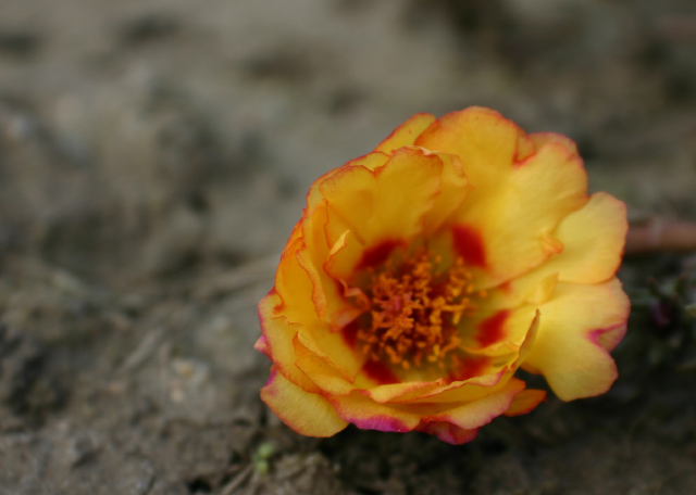
just a peachy portulaca on the brown ground
I really struggled with this challenge and its vagueness, but it was hella easier than "coffee shop"
Statistics
Place: 282 out of 318 Avg (all users): 4.0383 Avg (commenters): 3.0000 Avg (participants): 3.6786 Avg (non-participants): 4.3659 Views since voting: 904 Views during voting: 301 Votes: 235 Comments: 10 Favorites: 0
Complementary colours are pairs of colours that contrast strongly when compared to each other.
The red-tipped yellow petals would require a blue-violet background to demonstrate complementary colours. Your image demonstrates a duotone effect rather than the effect of complementary colours.
Check some of the forum discussions on complementary colours for suggestions on using colour for contrast.
My eye is immediately drawn to the the center of the flower, but the focus seems to be closer. I would have added a bit more depth of field to try and get it all in focus. I like the vivid color on the dry, brown dirt.







 Add photograph to your favorites
 Add photographer to your favorites


 Photographer found comment helpful.


